It is difficult to imagine a world without color.
Helen Keller said:
“I understand how scarlet can differ from crimson because I know that the smell of an orange is not the smell of a grapefruit…Without color or its equivalent, life to me would be dark, barren, a vast blackness…”
Yet most often, we take color for granted and often do not really see its true spectrum. Like light or air we know surrounds us, we miss the nuances. Learning about color opens eyes and enhances photographic vision.
As photographers, we focus on color and color’s narrative voice adds emotion, impact, and metaphor.
Color affects the food we eat, the clothes we wear, our purchases, our moods, even our body temperature. Marketers are well aware of the psychological and biological powers of color, and they use these factors to influence our behavior. Consider that nearly 85% of all purchases are powered by color, decisions are made within 90 seconds based on color, and color can improve reading, learning, and comprehension. (Psychology of Color, Hubspot, Lindsey Kolowich).
Read along to learn some interesting information on the colors red, yellow, and blue (pigment primary colors).

I often suggest that young children wear red shirts when photographing in a field of greenery. Red and green are complements, colors opposite each other on the color wheel (a topic thoroughly explored in both my color classes). Pairing red and green creates color harmony and adds contrast – POWer.
RED
The human eye is most sensitive to red and red evokes strong emotions. Seeing the color red can raise blood pressure and stimulate appetite – that is why so many restaurants use red as wall coloring or décor. Red, an attention grabber (think stop sign), is often used in packaging to stimulate impulse buying.
Red sits on top of the rainbow and brands such as Netflix, CNN, LEGO, Canon, Adobe, and YouTube embrace the power of red in their logos.

Notice how red logos pop or move forward against a white background. Red, considered a warm color moves forward. The use of black in the font adds contrast to the logo. White enhances the space of the name. Consider these same logos against a black background. I offer these logos to ignite thought. Are you using the right color in your logo and background to best convey your brand’s essence?

Food for thought, as some photographers prefer a black background for their websites. Notice how the yellow outline in the LEGO logo creates a shimmery effect and is therefore more eye-catching. Which background do you prefer, white or black?
Yellow

A yellow shirt was selected purposefully to create a high key (light tones). In addition to yellow’s warm qualities, a high key image evokes purity and hopeful notions. The yellow shirt adds a happy notation.
Yellow connotes cheerfulness, optimism, intuition, and warmth. Yellow stimulates the nervous system, encourages communication, but causes fatigue and eyestrain. For many yellow awakens our inner child – maybe we think of the yellow-rubber duckies or the happy face emoticons 😀
Yellow is used to grab attention, show clarity, and represents optimism. Notice how companies such as National Geographic, IMDb, Best Buy, Sundance Films, and Nikon incorporate yellow into their branding.

A yellow shirt was selected purposefully to create a high key (light tones). In addition to yellow’s warm qualities, a high key image evokes purity and hopeful notions. The yellow shirt adds a happy notation.
Yellow is the lightest of colors and evokes warmth, therefore it is the most common color found in home décor.
Blue
Blue, perceived as a constant, represents calmness and serenity and is associated with water and peace. Arguably the most popular universal color, the color blue also curbs appetite.

Blue, a cool color, recedes, creating depth and makes a perfect background for white. This color pairing fact can be applied to clothing, still lifes, and landscapes to enhance compositions.
Why are so many corporate offices decorated with blue? Working in a blue environment is known to increase productivity. Blue also infers trust and security – a blue suit remains the symbol of professionalism. Think about how many tech and social media companies use blue for their branding. Facebook, Twitter, LinkedIn, Vimeo, Dell, and Tumblr are just a few examples of corporations reinforcing trust, reliability, and confidence with color.

While these companies use blue as the hue (another word for color), you can see that there are many shades of blue and each has its own cultural connotations. For instance, dark blue is often associated with trust, dignity, intelligence and authority, whereas, bright blue connotes coolness and strength. Blue works beautifully against a white background.
So how do these color facts fit in with your photography?
First, learning about color theory, color psychology, and color biology will sensitize you to the world and your environment. Like wearing 3-D glasses, you will see depth and added clarity and feel more alive. You will be in tune with the power of color and understand how it is affecting and influencing you.
Second, you will notice more about your color preferences and hence your photographic motivations – chances are they are not as arbitrary as supposed.
As an exercise, review your photo library surveying color. I bet you will see a pattern, a propensity for a certain color or a category such as warm tones (red, yellow) or cool tones (blue, violet).
Lastly, strategize using color on your next photo outing. If you are photographing people, think about the colors of the clothes. Create color harmony and experiment to narrate personality. In my examples, I used family and children to illustrate the color theory logic, but the theories apply to all types of photography.
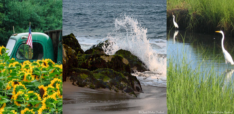
Quick question: Which do you prefer the cool blues or the warm reds? Send me an email: [email protected] and let’s start a conversation.
Join me for All About Color and More About Color (July only) and allow me to share my passion for color, a topic I have spent over ten years researching. I fell in love with the theory of color while working on my first book, The Art of Handpainting Photographs. Using washes of oil paints to enhance my photographs, I discovered the power of color and have been sharing my discoveries ever since.
Click here to read testimonials about how my color class has impacted students’ vision.
I also teach Photographing Children Naturally, based in part on my eBook and Painting Photos at bpsop.com.
I hope to see you in one of my online classes sometime soon!
All my best,
Cheryl
PS I am running a sweepstake on my FB page. I am giving away three Premium codes to a fantastic task management and to-do-list app – Todoist (yearly subscription $29 value).
Come on over to Facebook, like my page, and sign up (click the sweepstake tab) to win a fantastic tool to stay organized. Three winners will be chosen on July 15th. And of course, color labels are an intricate detail of this popular app.
Color Matters
By Cheryl Machat Dorskind


