I see triangles
I know what most of you are probably thinking right about now…has Joe sold out and embraced the rules of composition? Oh no Joe, say it ain’t so!!!
Well relax my fellow photographers because I have definitely not sold out, or ever will; you’ll have to pry my dead cold fingers of the shutter release before that happens. In fact, it took a lot just to even mention the word RULE….why? Because rules are a hindrance to creativity, the shackles of artistry, imagination, and inspiration…that’s why.
Having said this, there are times when certain “guidelines” are in order and when and whether to shoot odd number or even number of subjects when applicable. I will tell you this, in almost fifty years of shooting I’ve never thought about it. Anyone that ever tells you to never shoot an even number of anything has no idea what he’s talking about.
The pundits that look over and down on us to make sure we don’t do anything that would result in a downright just awful looking photograph, have absolutely nothing better to do than make you feel like a stooge if you break any of their silly rules. Case in point, the Rule of Thirds, and the Leading in Rule are two that come to mind.
Ok, the Rule of Odds states that having an odd number of subjects or objects in a photo will have more visual interest. Conversely, an even number of the same subjects or objects will result in the viewer separating them into pairs; creating symmetry and dare I say it…dullness.
Even numbers, the powers that be contend, will result in our brain dividing the subjects or objects, and what happens is that the photo is no longer viewed as a whole, but separate pieces. What a bunch of drivel….it’s pure BS…these people are all immature children all dressed up in their parent’s clothes!!
Total absurdity…what I would give to meet some of these people that think they know what they’re saying. If anyone out there knows of someone, please send them to me.
Don’t you think that the arrangement of said even number subjects or objects just might have something to do with it? What about the light and the color? Aren’t they two elements that are this just about as important as it gets???? Isn’t it possible that they could be wrong? Damn right they are, and I have countless photos to prove it.
As I said, there are times and places for everything, and I for one agree with a lot of what shooting odd subjects or objects does.
In my classes and workshops I show people how to incorporate the basic elements of visual design into their imagery.
Color, Light, Pattern, Texture, Balance, Form, and Shape are the elements and the one I want to talk about as far as the Rule of Odds is Shape. Although there are countless shapes, the four basic ones are: circles, squares, rectangles, and triangles; it’s the triangles that are important here…and what I want to talk about.
If I’m going to shoot an odd number, the reason will be two-fold: First, and this is about triangles, I like to arrange the subjects or objects in such a way inside my frame as to create a triangle; a visually interesting basic shape. Sometimes I try for an equilateral triangle as shown in the portrait above I took in Cuba of three waiters. Some times it’s an isosceles triangle with only two side equal…this can be implied to the point of being esoteric.
Btw, if I have to shoot an even number of four, I use a diamond as the shape; as in the photo of the four ballet dancers.
This is a good time to tell my fellow photographers why you should only crop in the camera. It’s important to use the edges of the frame as a computational tool. I have often used two of the edges to complete triangles.
When you have an odd number of images, and they are all close to being the same size and weight, the viewer will usually look at each one about the same amount of time, before going back to the one that drew the viewer in first. Btw, this will depend on things like the amount of light each will get. The above photo is a good example of always thinking of shapes.
If one gets more light than the other two, then the viewer will always travel to where the brightest light is first. Color will be another denominator.
Colors near the warm part of the spectrum will get more attention. For example red is bold and the viewer will be more aware of it in your composition.
The other reason to shoot an odd number is to create a line. Line is the most important of all the elements of visual design and without Line, none of the others would exist. You and I, planes, trains, and automobiles would cease to exist…why? Because we all have an outline.
I’ll use my subjects or objects in such a way as to move the viewer around the frame. They are no longer organic or non-organic things, but leading and/or directional lines.
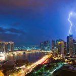
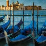
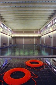
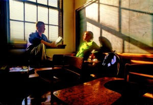
So here’s some examples of odd and even photos. Let me know which of the photos that has an even number are dull and boring:






-BPSOP Instructor: Joe Baraban
Joe Teaches:


