It isn’t always easy creating an ink-jet print that meets your expectations. In fact it can be downright frustrating. Here are my top 5 reason you may not be happy with your prints.
5) You’re trying to create a great print from a so-so file.
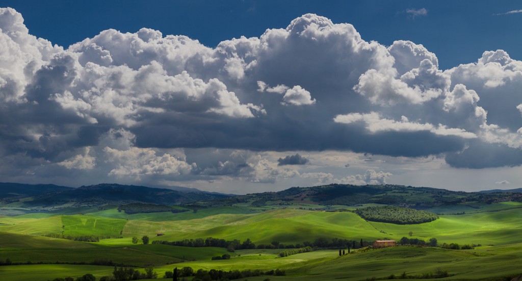
A poorly exposed image, particularly an over-exposed image with blown highlights will be difficult or impossible to print. Poor focus and camera shake induced blurriness can’t be corrected with any amount of Photoshop magic. The image below contains a pretty extreme brightness range. Careful exposure and processing can still produce a print that retains detail in the white clouds as well as detail in the important shadows.
4) Your expectations are unreasonable.
Out in the field, the range of brightness values can reach upwards of 1,000,000 to 1… meaning that the brightest sunlit areas can be up to 1,000,000 times brighter than the darkest shadows. That’s a range of about 20 stops! Your camera can’t capture a range this great; your computer monitor can’t display a range this great, but most importantly, no paper and ink combination can reproduce a range of brightness values that comes anywhere close to this range. So to deal with this, we have to take steps to reduce the brightness range when we can (setting aside HDR techniques for the moment, this means using reflectors or additional fill light, or using a graduated ND filter), expose carefully and correctly, and process the image files properly.
3) You may be over-processing your files, particularly by pushing the saturation levels too far.
Once again the limiting factor here is the paper and ink combination you are using. Coated papers can handle higher saturation than matte papers before blocking up: losing the subtle differences between the tones within an area of a single colour (think of the subtle shades of red in a Rose petal)
I loved the complementary colours in the image of this doorway in the Provencal town of Lourmarin. At first these colours looked great on my monitor, but needed to be dialed back to produce a good print and avoid losing the shading variations in the yellows and the blues.
Other than trial and error, the best way to gauge this is to learn to create and print from a soft-proof, (which I cover in my upcoming course, “The Art of Printing Your Art“)
2) Your monitor brightness is too high.
This is a pretty common situation. Most people have their computer monitors set far too bright for printing. A monitor that is too bright will result in prints that are too dark, (because you instinctively dial down the image brightness on your monitor in Photoshop or Lightroom to compensate). If this is happening to you… turn down your monitor brightness!
1) You’re not calibrating and profiling you monitor
This is the big one. Every computer monitor, even different examples of the same brand and model will reproduce colours differently than other monitors. Lightroom and Photoshop need to know how your particular monitor reproduces colour. With this information either of them can do the required colour transforms on-the-fly so that what you see in your prints ends up as close as possible to what you see on your monitor.
Despite these common problems, it’s actually pretty easy to create a great print; for most students, the missing ingredient is simply knowing a bit about what’s going on inside Photoshop or Lightroom, and then consistently following an appropriate workflow.
– Mark English – BPSOP Instructor
The Art of Printing and Selling Your Art begins October 9: I hope to see you then!

