Unless you’re a dedicated B&W photographer, colour represents a powerful part of any image you create. Colour evokes emotional responses in our viewers. Blue, the colour of the sky and sea can invoke feelings of calm and tranquility, yellow and orange: vitality and happiness. Red, perhaps the most commanding of our intention often denotes aggression, anger, or violence. Paradoxically, red can also denote passion and romance (red roses, for example).
Pairings of different colours have different emotional effects as well. Complementary pairs, those on the opposite sides of the colour wheel reinforce each other; making each appear stronger and more vibrant. Colours close to each other on the colour wheel form analogous or harmonious pairings that tend to subdue the impact of each other, and may often contribute to a calming or soothing effect. Looking at the pair of images below, which square contains the most vivid and saturated red circle?
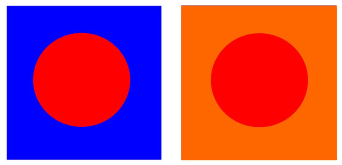
It’s a trick question, of course. The answer is — neither. In both cases the red circle is exactly the same shade, however the presence of blue, while not its exact complement, is close enough to reinforce the intensity of the red circle. In the second pairing, the orange background is a pretty good analogous pairing for the red and effectively subdues its impact.
Colour Triads
We can also move beyond thinking about simple pairings of colour and think also about creating colour triads; groupings of three colours that work together. Complementary pairings reinforce each other, creating a sense of energy and visual tension as one, or the other fights for your attention. A small bit of the complement to the predominant colour in an image will have an almost irresistible draw to your viewer’s eye. While this can be used to great effect, when overdone it can become visually exhausting. (Sidenote: whenever I show the Red-blue paring in the image above projected on a screen during my live classes, half the group inevitably gasps and turns their eyes away… the combination of these two near complements is just that intense!) The intensity of these complementary pairings needs resolution in much the same way that a well-crafted chord progression needs to resolve at the end of a song to leave us with a feeling of completeness and finality. Triadic colour combinations provide this same sense of resolution.
Triadic colour combinations can be created with any three colours chosen from equally spaced points around the colour wheel. Full disclosure, and so I don’t get “flamed” in the comments, while there are two predominant colour models used to describe colour, each based on a different set of primary colours, I am going to use the Red-Yellow-Blue model rather than the Red-Green-Blue model used to describe digital colour in your camera or computer monitor. The Subtractive R-Y-B model is commonly understood by painters and is likely the one you learned in grade school art classes. Using this R-Y-B model to combine yellow and blue paint to create green, makes intuitive sense. Similarly, combining Yellow and Red to produce Orange just seems to make sense as well. Using the R-G-B model of digital imaging, combining green and red light to create yellow, is perhaps not as intuitive. Either model can be used to create colour triads, but since it will be more intuitive to most readers, I am going to use the R-Y-B model here.
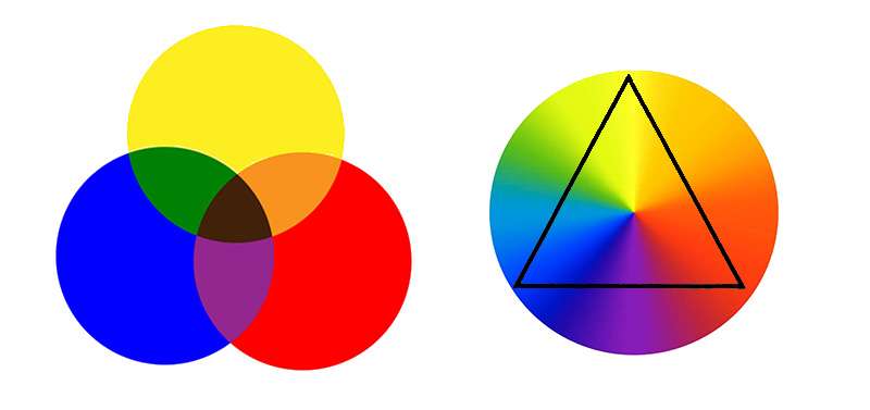
The three primaries of the Red-Yellow-Blue colour model (above left) combine (theoretically) to create every colour in the colour wheel on the right. Choosing any three equally spaced colours on the wheel creates a colour triad. Yellow for example, can be used to resolve the tension of the Red-Blue complementary pair from the previous image. With a little imagination, its easy to see how the triangle in the image above could be rotated around the colour wheel to create an infinite number of possible triad combinations. Keep in mind that triads are not limited to just combinations of the pure primary colours; we can also create more muted, softer triads by combining equally spaced pastel shades as well. Red, yellow, and blue form a common triad. Orange-green-violet is another. Slight shifts in these basic triads form additional possibilities; red-orange, yellow-green and blue-violet for example.
Psychologically, triadic combinations are dynamic and invigorating, creating visual contrast and harmony at the same time. They work best when one colour dominates; the remaining two playing the role of accents. Triadic colour groupings where all three colours are represented equally can be overpowering. This is particularly so when we combine saturated primary colours; saturated red, yellow and blue for example are often used in children’s toys (think “Fisher-Price”). The dominant colour in a triad will largely dictate the emotional impact of the combination. In a red-yellow-blue combination, if red dominates the triad will create a feeling of energy, passion and love or anger, yellow dominant combinations: warmth and intimacy, blue dominance will create a sense of calm and serenity.
In a photographic image making sense, it is not necessary for colour triads to be precisely accurate, although the closer they are to the ideal, the stronger will be the effect of the combination.
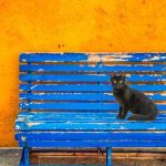
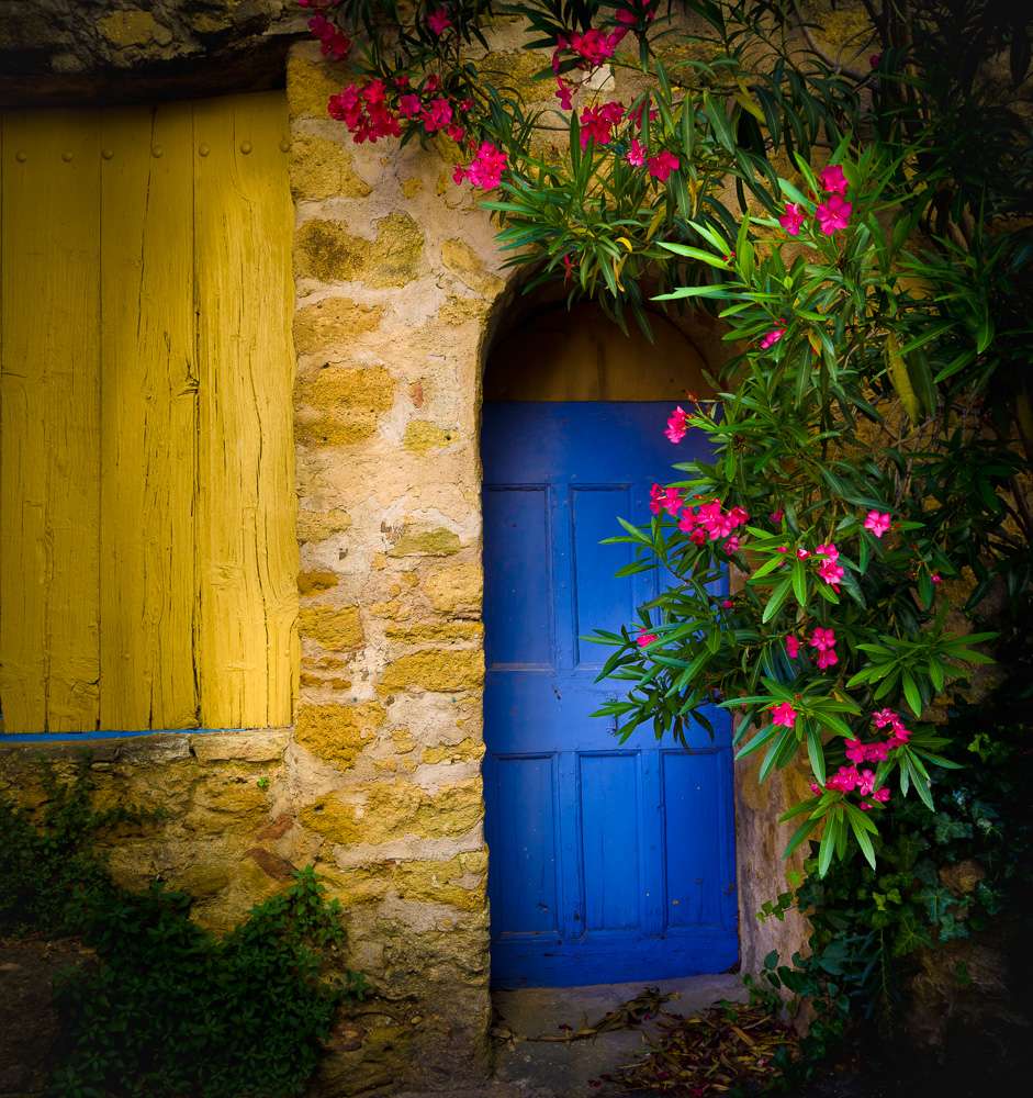
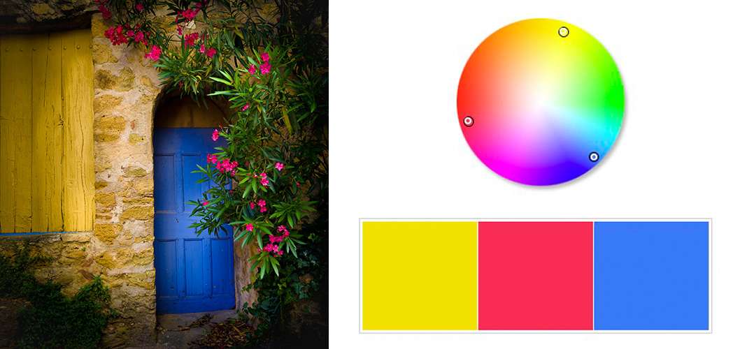
Have another look at the opening image. The yellow of the window shutter and the warm stone dominates the colour triad formed by the yellow shutter, blue door, and red flowers. This warm colour dominance creates a sense of warmth and intimacy. The complement of the blue door creates tension, resolved by the red flowers, creating an overall sense of harmony.
Using photoshop to sample the colours in the window shutter we can calculate the “perfect colours” to form a triad with the yellow (below on the right). The blue and red in the image are not precisely those of the “perfect” triad indicated by the dots on the colour wheel below and the colour patches shown, but they’re close enough.
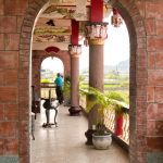
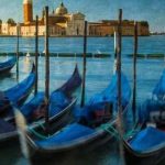
Colour triads are not overly common in nature, but they do exist — red and yellow fall leaves against a blue sky for example. Triads will most often be found where humans have exerted an influence, so urban and some rural settings will be fertile ground to find these colour combinations. Here are a few more to get you started. Note that the colour patches and dots on the colour wheel accompanying each image below are sampled from the actual image colours, rather than those of a “perfect” calculated triad based on the dominant colour in each image
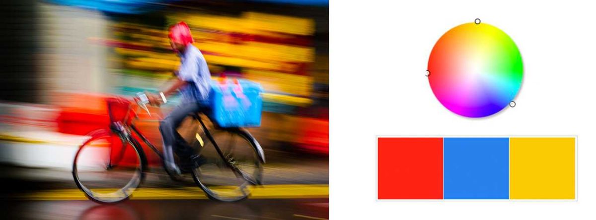
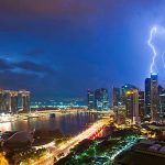
The colours in the image above form an almost perfect triad, based on the position of the sample dots on the colour wheel (the dots are very close to equidistant from each other). Whether the red or the yellow dominates here is up for debate. Given its overwhelming power, my vote goes to red. Combined with the inherent energy in any image panned at a slow shutter speed, the yellow plays its part and adds additional streaks of energy to the image. Blue completes the triad bringing resolution and some harmony.
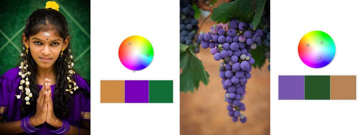
Both images above create variations on the orange-green-violet triad. In the image of the young girl from Singapore, her skin tone belongs in the warm area of the colour wheel. While green and violet are merely accents, they are also near complements of each other. The warmth of her skin tone brings resolution and harmony to the antagonistic relationship between the green and violet.
In the last image (right, above) the purplish colour of the grape cluster is clearly dominant, while the warm earth toned background and the green leaves serve as accents. In each case above the colours forming the triad are not perfectly equidistant around the colour wheel, but they are close enough to create the sense of harmony to what would otherwise simply be pairs of complementary colours.
Finding and using triadic colour in your own images can help to create images with the energy and impact of complementary colours, but also with a sense of completeness and harmony. To most viewers triadic colour schemes will be pleasing and somehow just seem “right”.
Naturally, finding and creating these combinations is done 99.9% in-camera. However, I am not above subtly tweaking the saturation or even the hue using the Temperature and Tint sliders in a local adjustment in Lightroom or Adobe Camera Raw. I will also admit to occasionally tweaking the Hue slider in a local adjustment as well. These adjustments will always be subtle since we are always striving for a believable reality. Sometimes though we need to take the viewer by the hand and lead their eye where we want it to go.
If you would like to continue this conversation on ways to refine and enhance your personal artistic vision, join me in my class, “After the Click”. Next session starting soon; I hope to see there.
-BPSOP Instructor – Mark English
Mark Teaches:
After the Click: Refining Your Vision in Lightroom & Camera Raw