 Auto White Balance: it’s one of the first things I ask my workshop students to turn off. When outdoors, choose Daylight or Cloudy white balance instead. Indoors, tungsten white balance will generally provide more pleasing results. Allowing your camera to decide something as important as the colour balance of your images can lead to washed out sunsets, and other less than optimal results as it tries to bring colour conformity to every image you make. For the most part this is good advice, but there is a world of creative possibility available by occasionally breaking the rules. Colour is one of the prime “mood setters” in image making. Using creative tweaks to the overall colour balance of your images can reinforce the message in your image by influencing the psychological reaction a viewer has to the content of your image.
Let’s look at two examples.
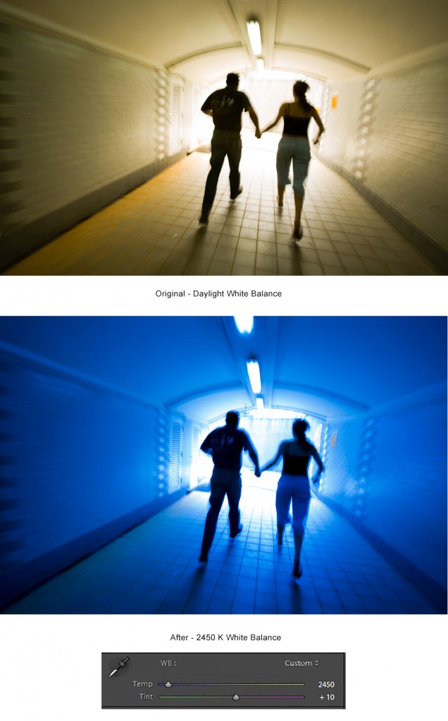
This first image was shot in a pedestrian tunnel many years ago. The concept was that of a couple fleeing from a threat or impending danger. I used a slow shutter speed of 1/15 sec to create a sense of motion, and ran behind the couple shooting dozens of frames over several takes. The initial Daylight balanced image (which was very close to AWB in this case) was kind of “no where” on the “mood scale”. Shifting the colour balance to 2430K in Adobe Lightroom, created an intense blue cast and helped to create a cold sense of foreboding; a sense of running from darkness to light. Overall its a stronger image that more clearly communicates its message. It has sold several times as stock.
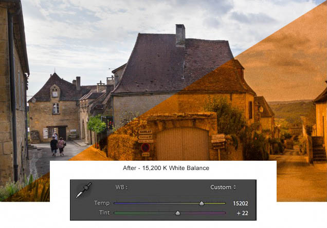
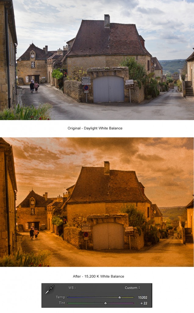
At the other end of the scale using an extreme warm balance can capitalize on the feelings of comfort, contentment and security these colour evoke. The image below is from the French town of Domme, in the area of the Dordogne River. The first image is just OK… barely, but not really. There’s nothing really wrong with it, it just doesn’t spark much of a reaction in the viewer. Shifting the white balance all the way to the right in Lightroom creates an entirely different feeling of “Old-World Europe”. Adding a fair dose of Grain and a little negative Clarity (to slightly soften and diffuse) in Lightroom completes the message of the image.
Instead of thinking about rules in photography, it’s better to think of them as guidelines or jumping off points for experimentation: you may be surprised by what you create.
-BPSOP Instructor: Mark English
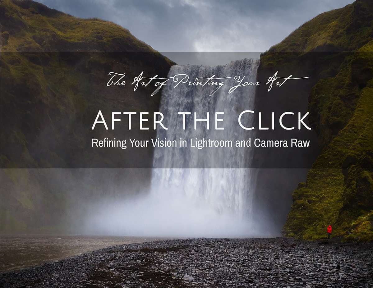
Mark Teaches: The Art of Printing & Selling Your Art